HSBC Logo: History, Meaning, Symbolism & Brand Heritage
![]()
Few financial institutions possess a visual identity as instantly recognizable as HSBC. Behind the famous red-and-white hexagon lies over a century and a half of global banking history, shaped across continents, cultures, and economic eras. HSBC’s roots reach back to the mid-19th century, when international trade was expanding at unprecedented speed. Founded to help merchants navigate the complexities of East-West commerce, the bank grew into one of the world’s leading financial organizations—today serving millions across more than 60 countries.
A brand with such reach and heritage requires a logo that is not only memorable but universally understood. HSBC’s emblem achieves exactly that: simple, geometric, symbolic, and deeply tied to the bank’s Scottish and Asian origins. While many financial institutions have shifted their branding multiple times, HSBC has remained remarkably faithful to its core symbol, refining rather than reinventing. The result is a logo that feels both historic and modern, grounded yet progressive.
Below is the complete journey of the HSBC logo, from ornate heraldry to a global minimalist icon.
Meaning and Legacy of the HSBC Logo
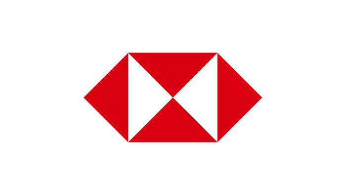
At the heart of HSBC’s branding is its geometric red hexagon, a stylized interpretation of the bank’s historic house flag. The design’s roots lie in the cross of St. Andrew, a nod to the Scottish heritage of founder Sir Thomas Sutherland. Over time, this simple symbol grew into one of the most recognizable corporate emblems in the world—instantly associated with safety, global reach, and financial continuity.
Logo Evolution Through the Years
![]()
Before 1983 — The Heraldic Origins
The earliest visual identity for HSBC featured an elaborate coat of arms: flowing ribbons, detailed linework, a decorative shield, and two supporting animals—one lion and one unicorn. Within the shield, a maritime scene with a ship referenced the bank’s early focus on international trade. This richly detailed emblem reflected the style of late-19th-century financial institutions: traditional, authoritative, and full of symbolic detail.
![]()
1983–2018 — The Modern Hexagon Takes Shape
In 1983, HSBC introduced the emblem that would redefine its brand. The ornate crest was replaced by a bold new symbol: a geometric red-and-white hexagon composed of six triangles. It resembled a folded envelope or box, representing movement, exchange, and global connectivity.
The wordmark appeared in a refined serif typeface—tall, elegant, and confident—balancing the sharp geometry of the icon. This was the first version of the logo that aligned HSBC with contemporary international banking aesthetics: clean, recognizable, and highly adaptable across print and digital media.
![]()
2018–Today — A Sharper, Stronger Identity
HSBC refreshed its logo once again in 2018, focusing on clarity and modernity. The red was deepened for stronger contrast, while the serif wordmark was replaced with a bold, compact sans-serif. This shift made the name more legible across small screens and digital environments, ensuring consistency in an era dominated by mobile banking.
The hexagon remained untouched—reinforcing its status as one of the most powerful symbols in global finance.
![]()
The HSBC Symbol and Its Cultural Roots
The distinctive hexagon wasn’t created without meaning. It was directly inspired by the house flag of The Hongkong and Shanghai Banking Corporation, which featured a red field with a white hourglass motif. That hourglass shape echoed the diagonal cross of St. Andrew, tying the bank’s Asian beginnings to its founder’s Scottish heritage.
Because many Scottish-founded companies created similar flags in 19th-century Hong Kong, the symbol became a shared visual language of trust and enterprise. When HSBC adopted the icon as part of its global brand, it preserved this heritage while pushing it into a clean, modern form.
Color and Typography
Color
Red has always been at the center of HSBC’s identity. Chosen for its associations with energy, prosperity, and confidence, the vibrant hue communicates action and reliability. Paired with white, it creates strong contrast and immediate recognizability. In some contexts, black typography is used to emphasize stability and professionalism.
Font
HSBC’s former serif typeface resembled Times New Roman and Baskerville Old Face, reflecting classical financial branding. The current sans-serif typeface is cleaner, bolder, and more contemporary—optimized for digital displays and small-scale use while preserving the brand’s clarity.
![]()
Why the HSBC Logo Remains a Global Icon
The evolution of the HSBC logo mirrors the evolution of the bank itself: rooted in tradition yet always ready to adapt to a changing world. Its hexagon emblem is not just a piece of graphic design—it is a symbol of history, geography, and global ambition. By refining rather than reinventing its identity, HSBC has created a timeless visual legacy built on clarity, trust, and heritage.
FAQ HSBC Logo
Why is the HSBC logo a hexagon?
The hexagon is inspired by the historic house flag of The Hongkong and Shanghai Banking Corporation. Its internal shapes echo the cross of St. Andrew, reflecting the Scottish heritage of the bank’s founder.
What do the colors of the HSBC logo mean?
Red represents energy, action, and prosperity. White symbolizes clarity and trust. Together, they create a strong, recognizable contrast.
When was the current HSBC logo introduced?
The core symbol dates to 1983, while the modern refined version—featuring updated typography and color adjustments—was introduced in 2018.
What font does HSBC use today?
HSBC uses a bold, modern sans-serif typeface that improves legibility in digital environments.
Has HSBC always used the hexagon symbol?
No. Before 1983 the bank used a detailed heraldic crest with animals, ribbons, and maritime themes. The hexagon marked a transition to modern, simplified branding.