
Visa Logo History: Heritage, Meaning & the Evolution of a Global Icon
![]()
In a world where borders feel smaller and commerce moves at the speed of a click, few symbols are as instantly recognizable as the Visa logo. For millions, this mark represents security, convenience, technological progress, and the promise that a transaction — no matter where you are — will simply work. But behind the minimalist blue-and-gold emblem lies a rich logo heritage spanning more than six decades, from California banking halls to a global payment network powering trillions in transactions each year.
This is the story of how Visa built one of the most trusted visual identities in the financial world — and how its logo evolved alongside its rise to global dominance.
From BankAmericard to Visa: The Beginning of a Financial Revolution (1958–1976)
Long before the Visa name appeared, the brand began its journey as BankAmericard, launched in 1958 by Bank of America. It was the first consumer credit card of its kind in the United States — a bold experiment in cashless payments that quickly outgrew its California roots.
The first BankAmericard logo featured a blue–white–gold tricolor banner, with “BankAmericard” printed in a simple sans-serif font. The colors weren’t random:
-
Blue represented the California sky
-
Gold symbolized the state’s sunlit hills and prosperity
As the card expanded nationwide in the 1960s, BankAmericard needed a more universal identity—one not tied to a single bank. Banks across the U.S. adopted the card, forming a network that eventually demanded a global, standalone brand.
This moment set the stage for a historic rebrand.
The Birth of Visa (1976): A Name for a Global Era
In 1976, BankAmericard officially rebranded as VISA — a name chosen for its universality. Easy to pronounce in nearly every language, “Visa” conveyed international acceptance and mobility.
The newly introduced VISA logo preserved the iconic blue-white-gold stripes but replaced the old wordmark with a stylized italic VISA in all caps. The slanted, sharp serif on the “V” gave the logo a sense of speed, progress, and forward movement — an early nod to the company’s future as a tech-forward payment network.
This 1976 redesign became the foundation of Visa’s modern logo identity.
Visa Logo Evolution: A Timeline of Refinement and Modernization
![]()
1958–1976: The BankAmericard Era
The original rectangular badge featured horizontal blue, white, and gold stripes with “BankAmericard” centered across the middle. Clean, simple, and easy to display on physical cards, it represented the first generation of credit innovation.
![]()
1976–1992: The Visa Name Takes Over
When BankAmericard officially became Visa, the striped badge remained, but the wordmark changed. The new italicized VISA, with its signature extended “V,” modernized the brand while keeping the original colors intact.
![]()
1992–2000: Cleaner Lines and Brighter Colors
Visa softened the color palette, lightened the stripes, and refined the typography. The wordmark grew larger, more legible, and more confident, aligning with Visa’s rapid global expansion.
![]()
2000–2006: The Last Stripe-Based Logo
This era saw a brighter, bolder evolution of the striped badge. The white center stripe widened, making space for a more prominent Visa wordmark as card designs became increasingly standardized worldwide.
![]()
2006–2014: The Minimalist Wordmark
Visa removed the stripes entirely, ushering in a new era of simplicity. The iconic “V” featured a golden accent while the rest of the letters remained blue, symbolizing a forward-looking brand in the age of digital payments.
![]()
2014–2021: Sleek Modern Gradients
Visa redesigned the wordmark using a deeper, more sophisticated gradient blue — almost violet in tone. The new palette reflected technological innovation and positioned Visa as a digital-first financial ecosystem.
![]()
2021–Today: A Brighter, Future-Ready Visa
In its latest update, Visa refreshed the blue to a lighter, more energetic tone. The simplified look strengthens its adaptability across screens, apps, terminals, and global digital platforms.
![]()
The Meaning Behind the Visa Logo
Beyond its clean typography, the Visa logo has always represented trust, reliability, global reach, and financial empowerment. Every evolution preserved its core values while adapting to new eras of technology and commerce.
Historically, blue and gold symbolized:
-
Blue: stability, trustworthiness, and clarity
-
Gold: prosperity, value, and excellence
Together, they form a visual language instantly associated with secure transactions and credibility.
The distinctive italic “V” reinforces motion and innovation — a reminder that Visa has always been a pioneer in financial technology.
The Visual Symbolism of Visa Cards Through the Years
Early Visa cards featured the tricolor stripes, taking up nearly a third of the physical card. The design served as a literal badge of trust, making it clear to merchants and customers that the card was part of a new, reliable payment network.
T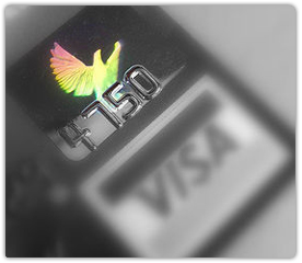 he symbolism strengthened over time:
-
The blue stripe represented the sky and possibility.
-
The gold stripe referenced Californian landscapes — and metaphorically, wealth.
-
The white stripe stood for neutrality and global acceptance.
By the 2000s, Visa introduced the holographic dove — a high-security feature appearing on most cards. Its iridescent effect helped authenticate genuine cards and became a well-known emblem of security.
Visa Today: A Universal Symbol in the Digital Economy
Visa has evolved far beyond a card issuer. Today, it powers:
– fintech solutions
– mobile wallets
– contactless payments
– global remittances
– e-commerce infrastructure
Its logo — clean, modern, globally consistent — reflects that evolution. The shift from stripes to pure typography mirrors Visa’s transition from a physical card network to a digital financial backbone.
Its logo history showcases a brand committed to clarity, reliability, and innovation — qualities that have shaped its global leadership for more than 60 years.
Why the Visa Logo Endures
The Visa logo’s longevity stems from its simplicity, symbolism, and adaptability. It bridges heritage and modernity — from BankAmericard’s colorful stripes to today’s sleek digital minimalism. Through every redesign, the logo has remained instantly recognizable, trusted, and globally meaningful.
Visa’s logo heritage is more than a design story. It’s the visual identity of a financial ecosystem that reshaped how the world pays, shops, travels, and connects.
FAQ (Original & SEO-Optimized)
Why is the Visa logo blue and gold?
The colors symbolize trust, reliability, and prosperity — values Visa has used since its early days as BankAmericard.
What does the slanted “V” represent?
Its sharp italic angle suggests motion and innovation, reflecting Visa’s role as a leader in payment technology.
Did Visa ever use a symbol besides the wordmark?
Yes. For decades, the brand used the iconic blue–white–gold stripes on every card before transitioning to a pure wordmark.
Why did Visa remove the golden accent from the “V”?
To modernize the logo for digital environments and ensure better clarity on screens and small interfaces.
Is the Visa logo the same worldwide?
Yes — Visa maintains a unified global logo for consistency, trust, and brand recognition across more than 200 countries.
Does the logo appear differently on Visa card tiers?
Sometimes. Premium Visa cards (Gold, Platinum, Infinite) may use metallic foils or embossed finishes, but the core logo remains consistent.