17 World-Renowned Brand Logos: Then and Now
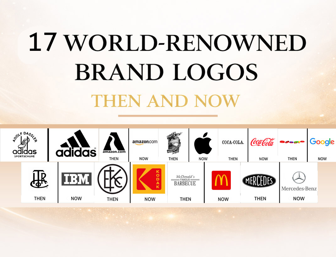
How the Most Famous Logos Evolved Without Losing Their Meaning, Symbolism, and Heritage
Every era changes the way brands must look. Not because audiences are shallow, but because the world’s visual language evolves. Screens get smaller, interfaces get faster, and attention becomes more fragmented. In this environment, a logo is forced to do the same job with fewer details: communicate trust, identity, and recognition instantly.
That is why logo history is rarely a story of pure creativity. It is a story of decisions. What a company chooses to keep is often more important than what it changes. Some brands moved from ornate crests to minimalist icons. Others barely changed at all, refining line weights and spacing as quietly as a luxury tailor adjusting a suit. Either way, the winners are the same: the brands that protect their recognition while improving clarity.
If you want deeper breakdowns beyond this pillar, explore our dedicated logo history pages such as Apple Logo History, Coca-Cola Logo History, and Nike Logo Meaning, plus our broader Logo History hub.
Below are fifteen of the most famous brands on Earth, selected not only for popularity, but because their “then vs now” evolution shows the most important rules in visual identity design.
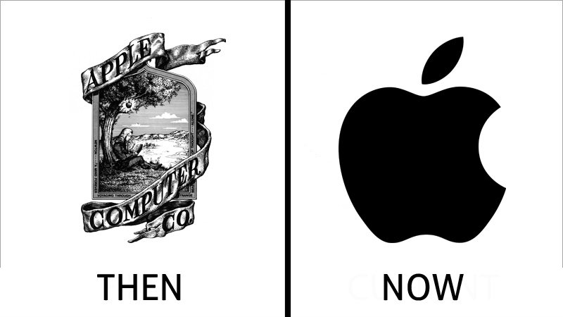
Apple Logo Evolution: From Illustration to Icon
Few transformations in logo heritage are as dramatic as Apple’s. The earliest identity was a narrative illustration, filled with detail and cultural reference. It belonged to an era when logos often acted like posters, explaining the brand’s “idea” through imagery and symbolism. It was intelligent, but it was not scalable. It could not survive the future that Apple itself would help create.
The modern Apple symbol is the opposite: a single silhouette, stripped of storytelling, yet overflowing with meaning. This is one of the most important lessons in logo history. Over time, the brand moved from explanation to recognition. The bite became a crucial design decision, preventing confusion with a generic fruit shape while adding personality and memorability. Apple’s logo meaning today is not literal—it is emotional. It signals confidence, design discipline, and a kind of technological minimalism that feels premium even without embellishment.
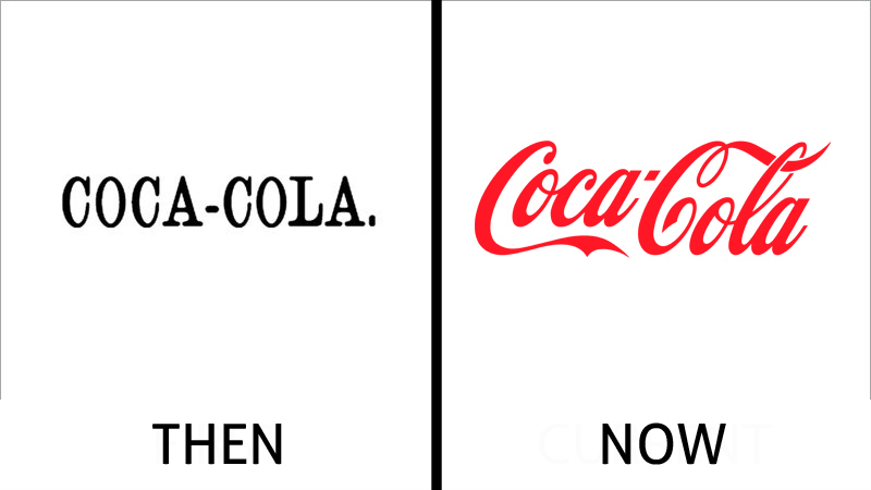
Coca-Cola Logo History: How Script Became a Global Signature
Coca-Cola’s identity is proof that the most powerful logo strategy can be refusal to abandon your core. The earliest versions were typographic, formal, and rigid, but the brand’s long-term success came from embracing script as a signature rather than a label. Over time, the famous cursive wordmark became less like a corporate mark and more like handwriting—personal, friendly, human.
This is the heart of Coca-Cola logo symbolism: familiarity. The mark behaves like a promise that never changes, even as products, packaging, and campaigns evolve. In the language of logo heritage, Coca-Cola represents a brand that treats its logo as an artifact—something protected, curated, and carried across generations. Its red palette intensified recognition through repetition. The result is a logo that doesn’t need explanation, even in markets where the language itself isn’t read.
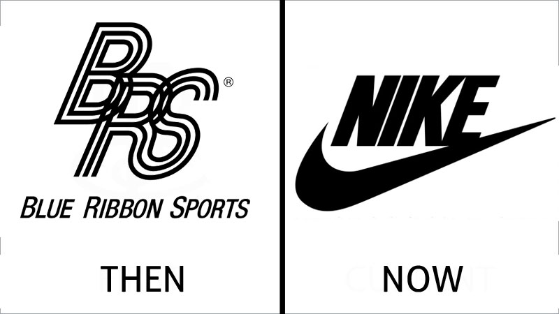
Nike Logo Meaning: The Swoosh as Pure Motion
Nike’s evolution is one of the clearest examples of modern logo meaning: a brand becoming so recognizable that it can remove its name. Early applications paired the symbol with typography to build association. Over time, the Swoosh matured into a standalone asset, becoming less of a “logo” and more of a cultural stamp.
The Swoosh is not decorative. It is motion turned into shape. It suggests speed, lift, forward momentum, and competitive energy. This is why Nike’s logo symbolism remains powerful on a shoe, a stadium banner, a phone screen, or a product tag. Minimalism here is not a trend; it is strategy. The brand’s origin in performance culture demanded a symbol that could live where words can’t: on moving bodies, fast imagery, and global sports narratives.
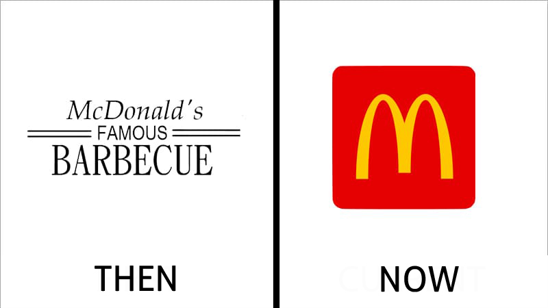
McDonald’s Logo Heritage: From Signage to the Golden Arches
McDonald’s logo story is inseparable from architecture. Early branding was more typographic, more literal, reflecting a developing business that still needed to explain itself. But the Golden Arches changed everything. Once the arches became the symbol, the logo no longer needed to describe food. It became a beacon.
This is a different kind of logo symbolism: environmental recognition. The arches are not simply a letter “M.” They are a memory of a place, a roadside landmark turned into a global icon. Over time, the brand simplified the form, strengthened its contrast, and learned to let the symbol carry the identity. The modern logo is a case study in how physical branding becomes visual shorthand. The logo meaning is comfort, familiarity, and predictability—exactly what fast food brands sell at scale.
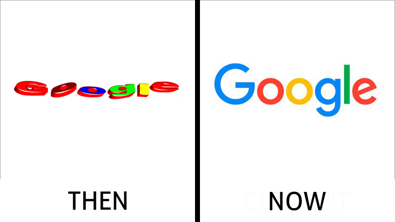
Google Logo Evolution: Color, Clarity, and Digital-First Identity
Google’s early identity leaned toward playful experimentation, showing the spirit of a young company. But as the brand matured and moved deeper into everyday life, the logo had to become clearer, faster, and more adaptable. The shift toward a cleaner sans-serif wordmark reflects the broader story of digital design: readability beats ornament when your logo must live on screens all day.
Google’s logo symbolism lives in color. The multi-color structure communicates diversity, approachability, and a sense of friendly utility. It avoids the coldness of corporate monochrome while still remaining precise. Its logo meaning isn’t luxury or tradition—it’s accessibility and speed. Google’s identity also illustrates a modern rule of logo history: a brand’s true mark is often the system, not just the wordmark. The “G” icon and color rhythm became assets that can travel across apps and devices without losing recognition.
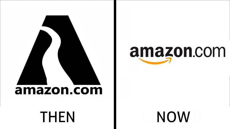
Amazon Logo Meaning: The Smile That Explains the Brand
Amazon’s early design leaned into literal origin—referencing geography and name. The modern identity shifted toward purpose and promise. The arrow from A to Z is one of the most effective examples of modern logo meaning because it does two jobs at once: it communicates selection (everything from A to Z) and emotion (a smile).
The logo symbolism works because it looks effortless. It doesn’t shout; it signals. The typography is quiet, the arrow is the story. And because the arrow can be separated and reused across interfaces, the logo became scalable across an enormous digital ecosystem. This is contemporary logo heritage: designing not for a sign, but for a system.
Microsoft Logo Evolution: From Wordmark to Modular Window
Microsoft’s identity moved from typography-led corporate branding to a modular symbol that fits software culture. The modern window icon feels simple, but its meaning is strategic: it suggests structure, layers, and a gateway to tools. It is a symbol of utility rather than lifestyle.
The Microsoft logo heritage shows how a brand can modernize without losing seriousness. The colors provide clarity and segmentation, helping the logo function across products. The symbol is not about nostalgia. It’s about compatibility with interfaces. In the context of logo history, Microsoft represents one of the cleanest transitions from corporate wordmark culture into icon-based digital branding.
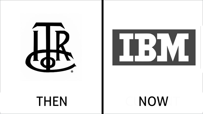
IBM Logo Heritage: Authority Through Reduction
IBM’s logo is one of the most disciplined in corporate identity. Earlier identities were more literal and typographic, often reflecting the era’s preference for heavy lettering and straightforward badges. The classic striped IBM mark refined the message: stability, structure, and precision.
The stripes carry meaning. They suggest data, systems, and technological rhythm. They also soften the heaviness of bold letters, making the identity feel engineered rather than aggressive. IBM’s logo symbolism is authority without noise. The evolution here is a reminder that simplification doesn’t always mean “friendly.” Sometimes it means “timeless and institutional.”
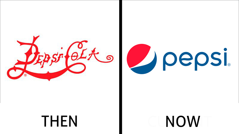
Pepsi Logo History: From Script Rivalry to the Globe
Pepsi’s earliest identity looked close to Coca-Cola’s, which makes sense historically: competitors often share the same visual language until one breaks away. Pepsi’s breakthrough came from embracing the globe as a central symbol. That move transformed the brand from a name into an emblem.
The globe’s red, white, and blue palette positions the identity culturally while also communicating energy and contrast. Over time, the mark became simpler and more abstract, aligning with modern packaging and digital needs. Pepsi’s logo meaning isn’t heritage in the aristocratic sense—it is modernity, motion, pop culture, and youth.
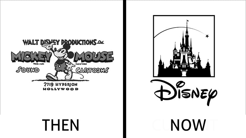
Disney Logo Symbolism: From Character Celebration to Castle Mythology
Disney’s earliest logos emphasized the studio’s characters and playful storytelling. Over time, the brand discovered that the strongest symbol wasn’t a character—it was the world the characters lived in. The castle became the emblem of fantasy itself, a gateway to the Disney experience.
This is deep logo symbolism: the mark represents not a company, but a feeling. The typography reinforces personality through its signature script, balancing nostalgia with recognition. Disney’s logo heritage succeeds because it’s not purely design—it’s mythology. It doesn’t just identify; it invites.
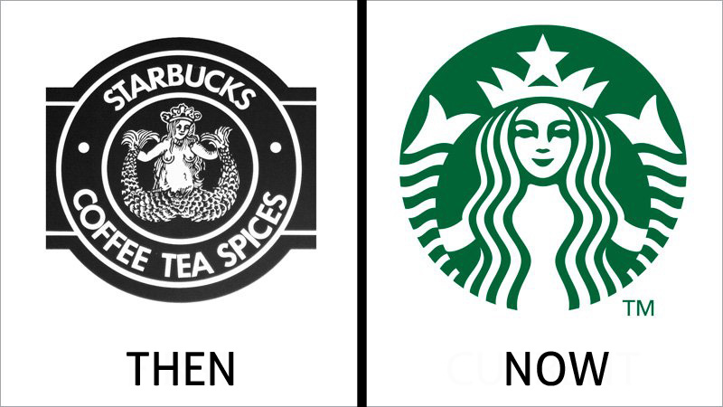
Starbucks Logo Evolution: Simplifying a Myth Into a Modern Brand
Starbucks began with an identity that leaned heavily into narrative and maritime myth. The siren was detailed, bold, and embedded in a circular frame of text. Over time, the company refined the emblem by removing distractions, strengthening lines, and eventually removing the wordmark entirely.
This is a classic modern brand move: when your symbol becomes recognizable enough, you remove the label. Starbucks’ logo meaning is built on ritual, familiarity, and premium everyday comfort. The siren is not simply decoration—it is a heritage anchor, linking modern coffee culture to an older world of trade, travel, and exotic origin stories.
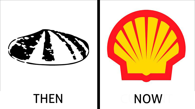
Shell Logo Heritage: The Power of a Single Object
Shell is a perfect study in evolutionary consistency. The early shell icon was uncertain, sketch-like, and monochrome, reflecting a time when logos often behaved like stamps rather than systems. Over the decades, the company sharpened the contours, stabilized the geometry, and introduced one of the most iconic color palettes in corporate history.
Shell’s logo meaning is industrial power expressed with surprising simplicity. The symbol is instantly readable at any scale. The evolution proves a key rule in logo history: if you have a strong object-based symbol, you protect it and polish it. You don’t replace it.
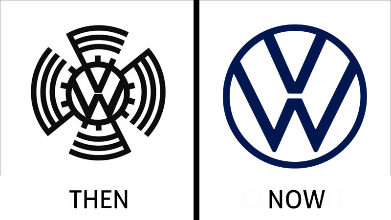
Volkswagen Logo Evolution: From Mechanical Badge to Pure Monogram
Volkswagen’s earliest badge carried industrial complexity, with framing elements that reflected mechanical identity and national-era badge conventions. The modern identity removed the noise, leaving a clean monogram inside a circle. This shift mirrors the transformation of automotive branding itself—from mechanical romance to modern interface culture.
Volkswagen’s logo heritage lies in the monogram. It stayed recognizable across decades because the core idea never changed: VW inside a circle. What changed was the execution, becoming flatter, cleaner, more digital. That’s the language of today’s design.
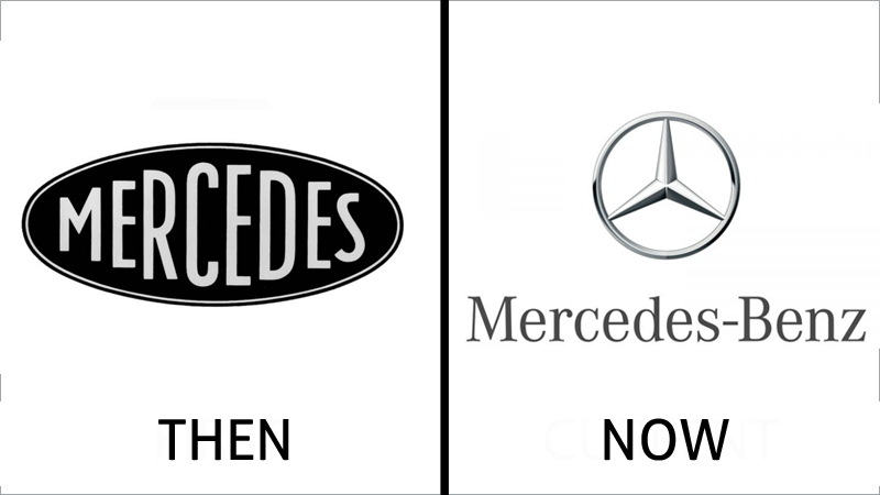
Mercedes-Benz Logo Meaning: The Star as Engineering Prestige
Mercedes-Benz is one of the most powerful examples of how a simple shape can represent a universe of meaning. The three-pointed star is both symbol and statement. It communicates dominance, precision, and ambition. Over time, the identity moved toward minimalism, strengthening the mark as a modern luxury icon.
Its logo symbolism is consistent: engineering excellence elevated to cultural status. The circle frame makes it feel complete and official, like a seal of authority. The evolution shows how high-end brands treat logos as emblems, not marketing graphics.
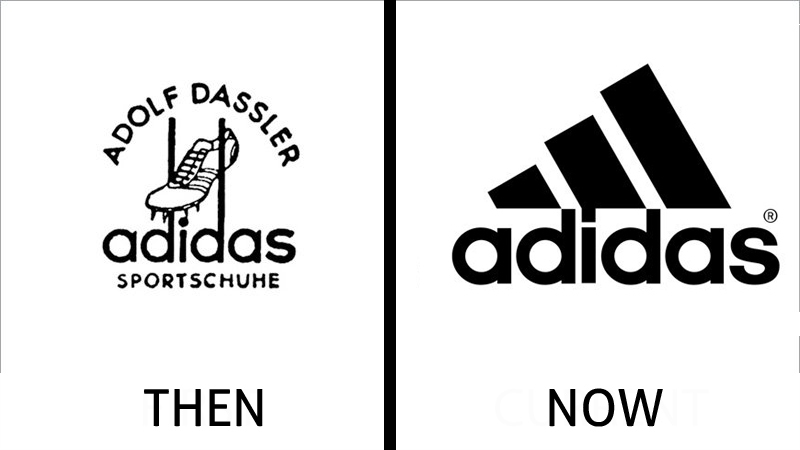
Adidas Logo Heritage: Three Stripes as a Design Language
Adidas’ early identity was more illustrative, celebrating founder heritage and product specialization. Over time, the brand discovered the true asset: the stripes. The modern Adidas identity is not one logo—it is a family of marks that all revolve around the same principle.
This is what makes Adidas important in logo history. The stripes became a design language. They can appear on a shoe, a sleeve, a storefront, or a digital ad, always reinforcing recognition. The logo meaning is performance through consistency.
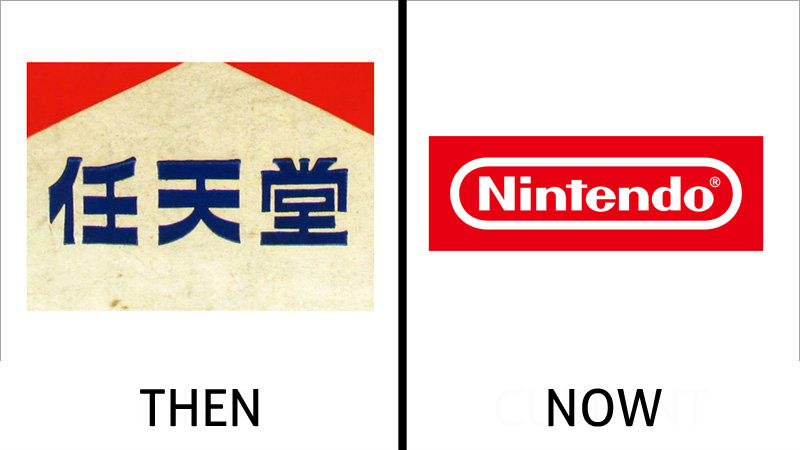
Nintendo Logo Evolution: Playful Confidence Through Red and White
Nintendo’s early identity reflected a different era of branding, with forms that could feel regional or traditional. The modern red field and white lettering became a universal gaming signal. The rounded rectangle frame is especially important: it behaves like a stamp, a badge of authenticity.
Nintendo’s logo symbolism is straightforward but powerful: familiarity, play, and trust. The red is energetic. The white type is accessible. The identity feels like an invitation and a guarantee at the same time.
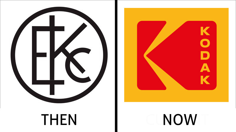
Kodak Logo History: From Traditional Seal to Bold Letterform
Kodak’s story is one of dramatic simplification. Early marks leaned into medallion-like traditions. Later identities centered on the letter “K” as a bold symbol—an industrial monogram that could live on products, film packaging, and camera bodies.
Kodak’s logo meaning reflects an era when technology brands wanted to look confident, loud, and unmistakable. Even as the company’s market shifted, the design demonstrates how strong typographic symbols can carry legacy long after the original product era changes.
What “Then vs Now” Really Teaches About Logo Heritage
A “then and now” comparison is not just nostalgia. It is a practical education in how brand identity survives. The most famous logos did not become iconic because they were beautiful once. They became iconic because they learned how to remain recognizable while the world changed.
The first major pattern across these brands is reduction. Over time, details disappear. Frames become thinner. Shadows vanish. Letterforms become cleaner. This is not because designers ran out of ideas, but because modern environments demand speed and legibility. A logo must work on a phone icon, a watch screen, a storefront, a billboard, and a social media avatar—often all in the same day. That reality forces brands to distill identity into its most essential shape.
The second pattern is symbolism that matures. Early logos often tried to explain what a company was. Canon referenced spirituality and tradition. Apple referenced scientific myth. Early Burger King used narrative illustration. But the modern era rewards brands whose symbols communicate emotion rather than description. Nike communicates motion. McDonald’s communicates comfort. Amazon communicates satisfaction. Shell communicates power. These marks are not “literal,” yet they feel more truthful because they express the experience the brand wants to own.
The third pattern is heritage discipline. The brands with the strongest logo heritage are those that protect their core assets. Coca-Cola refuses to abandon its script because it is its identity. Mercedes-Benz protects the star because it carries prestige. Volkswagen protects the monogram because it is the anchor of recognition. Starbucks protects the siren because it is a cultural stamp. In each case, change is controlled, not chaotic.
Finally, these logos prove that the best brand identities are designed for memory. People don’t remember design details. They remember shapes. They remember color rhythm. They remember silhouette. The greatest logos in history are not the most complicated. They are the most repeatable.
That is the real lesson of logo history: a logo becomes legendary when it turns into a shortcut in the human mind. When a symbol can trigger trust, desire, familiarity, or prestige in less than a second, it stops being a graphic. It becomes a cultural object.
FAQ: World-Renowned Brand Logos Then and Now
Why do famous brands simplify their logos over time?
Because modern environments demand clarity. Logos must work at small sizes on digital screens and still remain recognizable on signage. Simplification improves legibility, consistency, and speed of recognition.
Does simplifying a logo reduce its meaning?
Not when done correctly. In strong logo history examples, simplification often increases meaning by removing distractions and strengthening the core symbol that people remember.
What makes a logo timeless instead of trendy?
A timeless logo relies on stable geometry, disciplined typography, and symbolism tied to brand origin or brand promise. Trendy logos usually chase short-term aesthetics rather than long-term recognition.
Which matters more: logo symbolism or logo recognition?
They work together. Symbolism gives emotional depth, but recognition is what makes the symbol valuable. The best logos build symbolism slowly through consistent exposure over time.
How can a new brand learn from these logo evolutions?
By prioritizing scalability and memory. The goal is to design a logo that remains clear at small sizes, has a strong silhouette, and communicates a single promise instantly.
Do global brands ever change their logos completely?
Rarely, and usually only when recognition is weak or the brand is redefining itself. Most world-class brands refine rather than replace, because rebuilding recognition is expensive and risky.