
American Airlines Logo History: Meaning, Symbolism & Brand Heritage
![]()
Within global aviation logo history, American Airlines occupies a rare and influential position shaped by both cultural symbolism and design leadership. Established during the formative years of commercial aviation, the airline developed in parallel with the modern air travel industry itself. As a result, its visual identity was never merely decorative. Instead, the American Airlines logo consistently functioned as a reflection of national confidence, technological advancement, and changing perceptions of scale and reliability.
The American Airlines logo history is inseparable from the broader evolution of airline branding in the United States. Early iterations leaned heavily on patriotic symbolism, reinforcing trust and national presence at a time when flying was still perceived as experimental. Later redesigns embraced modernist restraint, echoing the industry’s shift toward efficiency and global reach, a transition also visible in United Airlines logo history and the disciplined corporate identity explored in Delta Air Lines logo heritage. In its most recent phase, American Airlines adopted abstraction and motion-driven form, aligning with contemporary branding philosophies centered on simplicity and adaptability.
Few carriers have managed to preserve such strong logo heritage while allowing their identity to evolve meaningfully across decades. The American Airlines logo stands as a visual chronicle of aviation progress, illustrating how branding can mature without severing ties to origin, symbolism, and cultural relevance.
Meaning and History: The Origin of the American Airlines Identity
American Airlines was officially established in 1930 through the consolidation of several smaller carriers operating across the United States. Initially known as American Airways, the company entered an industry that was still defining itself. Safety, reliability, and national pride were essential messages, and these values became central to the airline’s early logo meaning.
Interestingly, the airline did not immediately rely on a full wordmark. For decades, its identity centered around the “AA” monogram paired with patriotic symbols. This choice reflected both practical design constraints of early aviation branding and a desire to project authority without unnecessary complexity.
As American Airlines expanded internationally, its visual identity matured alongside its operational reach. Each redesign represented not a rejection of the past but a reinterpretation of the same core ideas: freedom of flight, national identity, and technical excellence.
Logo Symbolism: Eagle, Nation, and Motion
The eagle has remained the most enduring symbol in American Airlines logo symbolism. As a national emblem of the United States, the eagle communicates strength, freedom, and sovereignty. In aviation, it also naturally aligns with the idea of flight, vision, and dominance of the skies.
Red, white, and blue have consistently defined the airline’s color palette, reinforcing its American origin while conveying authority and trust. Over time, these elements became less literal and more abstract, moving from illustrated emblems to geometric forms and finally to symbolic motion.
The gradual abstraction of the eagle reflects a broader shift in brand identity design, where suggestion replaces illustration and symbolism becomes more conceptual.
American Airlines Logo History Timeline
![]()
1934–1945: Patriotic Emblem with National Power
The first official American Airlines logo was introduced in 1934. Designed by Goodrich Murphy, it featured a white eagle with wings raised, standing atop a globe inside a deep blue circle. Two red capital “A” letters flanked the bird, while a bold red diagonal stripe cut across the background.
This emblem strongly emphasized national identity and global ambition. The globe suggested international reach, while the eagle symbolized authority and freedom. The red, white, and blue palette reinforced patriotism during an era when aviation was closely tied to national prestige.
![]()
1945–1962: Softer Imagery and Postwar Optimism
Following World War II, American Airlines softened its visual identity. The eagle remained central but was redrawn in blue and repositioned between two blue “A” letters. The background adopted a lighter tone with stylized cloud imagery, creating a calmer, more optimistic mood.
This redesign reflected the postwar expansion of commercial aviation as a civilian service rather than a military or governmental endeavor. The logo became less aggressive and more approachable while preserving its symbolic core.
![]()
1962–1967: Transitional Identity with Combined Elements
In 1962, the airline reintroduced the bold red, white, and blue palette. The eagle-and-monogram emblem was placed above an italicized “American” wordmark written in uppercase blue letters. A thick red circular frame enclosed the composition.
This version blended elements from previous logos, acting as a bridge between illustrative symbolism and the modernist identity that would soon follow. It emphasized movement, confidence, and brand cohesion during a period of rapid industry growth.
![]()
1967–2013: Modernist Icon Designed by Massimo Vignelli
The most influential chapter in American Airlines logo heritage began in 1967 with a redesign by Massimo Vignelli. This version abandoned illustrative imagery almost entirely, replacing it with a typographic and geometric solution that would define the brand for more than four decades.
The wordmark “AmericanAirlines” was written without spacing in a bold sans-serif typeface, using red for “American” and blue for “Airlines.” Above it, two large capital “A” letters—one red, one blue—framed a simplified blue eagle.
This logo became iconic for its clarity, balance, and timelessness. It represented American Airlines as modern, efficient, and globally competitive, aligning perfectly with the jet age and the rise of corporate design systems.
![]()
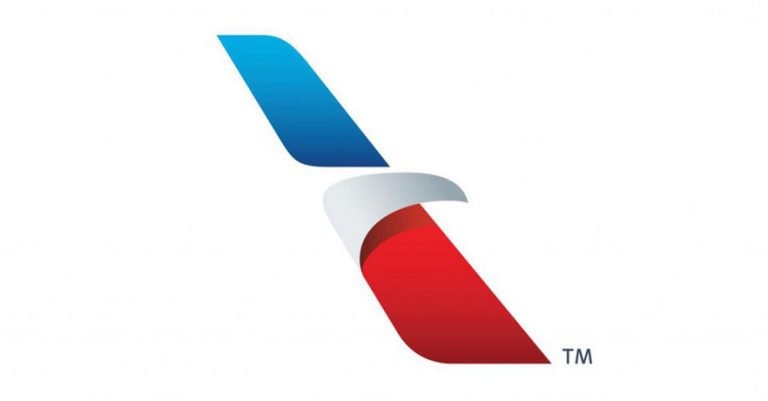
2013–Today: The Flight Symbol and Abstract Motion
In 2013, American Airlines introduced a new visual identity created by FutureBrand. The logo features a refined dark-blue wordmark accompanied by an abstract emblem known as the “Flight Symbol.”
The emblem depicts a stylized eagle head formed through overlapping red, white, and blue shapes arranged along a diagonal axis. The design suggests both an eagle in motion and an aircraft wing, merging heritage with modern abstraction.
This version emphasizes movement, speed, and adaptability while preserving the symbolic eagle at the heart of the brand.
Shape, Typography, and Color Evolution
American Airlines’ typography evolved from serif and italicized forms to clean, geometric sans-serif lettering. The current wordmark is elegant and restrained, prioritizing legibility across digital and physical environments.
Color remains a central pillar of the brand’s logo description. Red conveys energy and determination, blue signals trust and professionalism, and white provides balance and clarity. The modern logo uses these colors more selectively, allowing form and motion to carry greater meaning.
American Airlines Logo Heritage and Aviation Identity
The American Airlines logo history illustrates how a brand can evolve without losing its essence. By maintaining consistent symbolism while adapting form and execution, the airline created a visual identity that feels both historic and contemporary.
Its logo heritage reflects the broader story of aviation itself, moving from national pride and illustration to modernist clarity and abstract motion. In doing so, American Airlines established one of the most enduring and respected identities in global aviation branding.
FAQ: American Airlines Logo Meaning and History
What does the American Airlines logo represent?
The logo represents freedom, national identity, and the pursuit of excellence through the symbolic use of the eagle and patriotic colors.
Why is the eagle important in the American Airlines logo?
The eagle is a national symbol of the United States and represents strength, vision, and freedom of flight.
Has the American Airlines logo changed many times?
Yes, the logo evolved several times since 1934, with major redesigns reflecting shifts in aviation, design philosophy, and brand positioning.
Who designed the most famous American Airlines logo?
The iconic 1967 logo was designed by Massimo Vignelli, while the current “Flight Symbol” was created by FutureBrand in 2013.