
Disney Logo History: Meaning, Symbolism & Brand Heritage
![]()
There are brands that entertain, brands that innovate, and brands that define entire generations — but Disney stands alone as a storyteller whose magic has shaped childhoods across the globe. From Steamboat Willie to The Lion King, from Disneyland to Pixar, Disney has built an empire of imagination. And at the center of this legacy lies one of the world’s most recognizable brand symbols: the Disney logo.
More than a signature, more than a castle, and more than a piece of graphic design, the Disney logo represents hope, fantasy, dreams, and the promise that “wishing upon a star” still matters.
This article blends the full historical record and visual evolution of the Disney logo into one complete heritage overview — from Mickey’s early appearance to the iconic Cinderella Castle we know today.
Meaning and History
Disney Brothers Cartoon Studio was established in 1923 by Walt and Roy Disney. Walt, inspired by cel animation at his previous job in Kansas City, carried a passion for storytelling and character creation that would soon revolutionize global entertainment.
By 1928, Mickey Mouse appeared in Steamboat Willie, becoming one of the most influential cartoon characters of all time. The company expanded into feature films in the 1930s, and through decades of innovation, The Walt Disney Company evolved into a powerhouse spanning films, theme parks, merchandise, television networks, streaming, gaming, theater, and more.
The Disney logo has always reflected this evolution. Each redesign marked a new chapter: from early character-based branding to the now-familiar castle representing fantasy, optimism, and magic.
Disney Logo Evolution Through the Years
1929–1937: Mickey Mouse Front and Center
The first Disney logo placed Mickey Mouse at the heart of the design — an unmistakable declaration of the company’s identity at the time. Surrounding Mickey were inscriptions like “Walt Disney Productions” and the studio address, giving the emblem a dense, busy layout typical of early animation branding.
It felt like a theatrical poster — packed, lively, and unmistakably character-driven.
![]()
1937–1948: The Signature Emerges
In 1937, everything changed. Mickey disappeared, and for the first time, the focus shifted to the “Walt Disney” signature in a whimsical script.
This handwritten look, inspired by Walt Disney’s personal penmanship and animation linework, set the foundation for what would become one of the most famous wordmarks in the world. It was artistic, expressive, and — surprisingly — highly legible.
![]()
1948–1979: A More Decorative Look
A new version appeared with wavier lines, darker strokes, and typography that was elegant but more difficult to read. The letters blended into each other, creating personality but sacrificing clarity.
Still, this version helped strengthen the magical, handcrafted personality associated with Disney animation.
![]()
1972–1983: Refinement and Simplicity
In 1972, Disney refined the script again, improving legibility while preserving the playful charm.
This redesign introduced the word “Productions” in a plain sans-serif typeface, creating a visual contrast between the artistic script and the business descriptor.
![]()
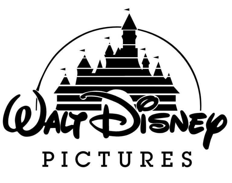
1983–1985: “Pictures” Replaces “Productions”
As Disney grew in cinematic prestige, the tagline changed to “Pictures”, set in a serif typeface. This small change marked Disney’s increasingly film-focused ambitions and laid the groundwork for the iconic castle era.
![]()
1985–2006: The Debut of the Castle
1985 marked a turning point: Cinderella’s Castle made its first appearance, positioned above the script wordmark.
The design was simple, drawn with horizontal line cuts, and appeared against a deep blue background. An animated star traced an arc overhead — an element that became a beloved part of Disney film intros for years.
This emblem symbolized imagination, magic, dreams, and childhood wonder more clearly than anything before it.
![]()
2006–2011: A More Detailed Castle
As animation technology progressed, so did the castle. In 2006, the castle became more intricate, with illuminated rooms, sharper towers, and a shooting star accompanying the arcing line.
The word “PICTURES” was now entirely uppercase, echoing cinematic grandeur.
![]()
2011–Today: The Streamlined Disney Logo
In 2011, Disney simplified its branding dramatically.
The castle remained, but everything beneath it — including “Walt,” “Pictures,” and earlier descriptors — was removed. Only the iconic “Disney” script stayed.
This minimalistic approach made the logo adaptable across theme parks, streaming (Disney+), merchandising, and digital media, while retaining its unmistakable identity.
![]()
Meaning and Symbolism
The Castle
The castle symbolizes magic. It represents fairy tales, dreams, imagination, and the promise of possibility — core pillars of the Disney brand.
Though inspired by Cinderella’s Castle, it eventually evolved into a stylized symbol uniquely tied to Disney’s own mythology rather than any specific structure.
The Shooting Star
The star that arcs above the castle represents hope, wish-making, and the classic Disney theme: “When You Wish Upon a Star.”
It’s not just an animation flourish — it’s a promise of wonder.
The Walt Disney Signature
The script is based loosely on Walt Disney’s handwriting, symbolizing authenticity, creativity, and the handcrafted artistry behind animation.
It’s nostalgic, expressive, and instantly recognizable.
Emblem and Visual Style
Throughout its evolution, Disney demonstrated a rare ability to modernize without losing character. The castle grew more detailed, then more simplified, then more cinematic depending on the era.
Special intros for films often featured unique castle versions — icy designs for Snow Dogs, UFO arcs for Lilo & Stitch, shining gold for anniversary editions, etc.
Disney’s emblem adapts without ever losing its heritage.
Font & Color
The Disney font — resembling Walt Disney’s handwriting — is custom and proprietary. It blends calligraphic strokes with playful curves, creating a logo that feels personal and animated, yet timeless.
Disney’s color palette varies widely depending on film intros, but the core identity traditionally features deep blues, bright whites, and shimmering highlights. These colors evoke magic, excitement, and a sense of wonder.
![]()
FAQ
What does the Disney logo symbolize?
Magic, imagination, creativity, and the promise of dreams coming true.
Why does Disney use a castle in its logo?
It was inspired by Cinderella’s Castle and later evolved into a universal fairy-tale icon representing Disney magic.
Is the Disney signature really Walt’s handwriting?
It’s inspired by his handwriting but stylized for branding.
Has the Disney logo changed a lot?
It has gone through several redesigns, from Mickey-centric imagery to the modern castle-based logo.
Why is the Disney castle sometimes different in movie intros?
Disney customizes the castle to match the tone, themes, or setting of specific films.
5 Facts About Disney You Probably Didn’t Know
1. The first Disney logo included Disney’s address printed directly on it.
2. Walt Disney originally voiced Mickey Mouse himself.
3. The castle in the logo later became the inspiration for Disneyland Paris’s iconic structure.
4. Disney has released custom animated logo intros for dozens of films, each with unique effects.
5. The “Disney” signature is one of the most counterfeited wordmarks in the world due to its popularity.