Victoria’s Secret Logo History: Meaning, Symbolism & Brand Heritage
Few fashion brands have reached the level of global recognition achieved by Victoria’s Secret. For decades, the label shaped not only the lingerie market but also the visual language of modern femininity. From glossy catalogs and televised runway spectacles to minimalist storefronts across the world, Victoria’s Secret built a powerful identity in which branding played a central role.
Within the broader framework of logo history, logo meaning, and brand heritage, Victoria’s Secret stands alongside other defining fashion names such as Calvin Klein logo history, Chanel logo symbolism, and Dior brand heritage. Its logo evolution reflects changing cultural attitudes toward luxury, femininity, and mass-market aspiration.
Meaning and History: The Birth of an American Fashion Phenomenon
The origin of Victoria’s Secret dates back to 1977, when Roy Raymond, an American entrepreneur, struggled to find lingerie he considered elegant enough to gift his wife. Dissatisfied with the retail experience offered by traditional underwear stores, Raymond envisioned a new kind of boutique—one that would make men comfortable shopping for lingerie and elevate the product’s presentation.
That same year, the first Victoria’s Secret store opened, introducing a refined, almost Victorian-inspired atmosphere. Early success led to catalog sales and rapid expansion. By the early 1980s, the brand was generating millions in annual revenue.
A pivotal turning point came when Leslie Wexner, founder of a major retail empire, acquired Victoria’s Secret. Under his leadership, the brand shifted from a niche concept to a mass-market powerhouse, redefining lingerie as both aspirational and accessible.
Victoria’s Secret Logo History Timeline
![]()
Late 1970s–1980s: Ornate Beginnings
The earliest Victoria’s Secret wordmarks appeared in catalogs shortly after the brand’s founding. These versions featured decorative script typography with fine details and flourishes, evoking a vintage, almost European sensibility. The lettering aligned with the brand’s original vision of refined intimacy and old-world elegance.
As the company expanded during the 1980s, these ornate scripts gradually gave way to more legible serif and sans-serif typefaces. The focus shifted from fantasy-driven design to clarity and scalability.
1990s–2009: Feminine Minimalism
By the 1990s, Victoria’s Secret had settled on a logo that would define the brand for nearly two decades. The wordmark featured a lightweight serif typeface, most often rendered in soft pink against a white background. The brand name was arranged on two lines, with no additional graphic elements.
This era coincided with the rise of the Victoria’s Secret Fashion Show and the introduction of the Angels, which transformed the brand into a global cultural phenomenon. The logo’s restrained elegance allowed it to coexist with highly theatrical marketing without visual conflict.
![]()
2009–Today: Modern Utility
In 2009, Victoria’s Secret introduced a refined version of its logo. The redesign preserved the brand’s typographic heritage while modernizing its structure. The name was consolidated into a single line and rendered in black uppercase letters.
A subtle but important detail distinguishes this version: the initial letters “V” and “S” are slightly larger than the rest of the wordmark. This adjustment improves visual hierarchy and differentiates the logo from competitors using similar serif typography.
The result is a cleaner, more utilitarian logo suited to digital environments and global retail applications.
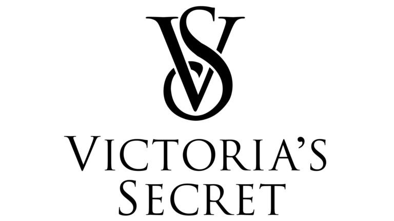
Emblem and Monogram: The VS Symbol
In addition to the wordmark, Victoria’s Secret uses a distinctive “VS” monogram. This emblem features two intertwined serif letters, with the elongated tail of the “S” wrapping elegantly around the vertical stroke of the “V.”
The monogram is used selectively, appearing on accessories, beauty products, packaging, and select branding materials. While typically rendered in flat black, the emblem is sometimes enhanced with glossy finishes or subtle gradients, adding depth without compromising sophistication.
Logo Symbolism: Femininity Through Restraint
The symbolism of the Victoria’s Secret logo lies in its balance between softness and authority. Serif typography conveys tradition, luxury, and refinement, while the minimalist composition avoids excess ornamentation.
Pink, long associated with the brand, symbolizes femininity, tenderness, and sensuality. Black introduces contrast and maturity, grounding the brand’s identity and preventing it from appearing overly playful. White serves as a neutral backdrop, enhancing clarity and elegance.
Together, these elements create a visual identity that communicates confidence without aggression and sensuality without explicitness.
Typography and Visual Language
Over the years, Victoria’s Secret has relied on carefully selected and customized serif typefaces. In the early 2000s, the brand used a modified version of Adobe’s Trajan, designed by Carol Twombly. Later, it transitioned to a customized Bell typeface from Monotype.
These typographic choices reflect a desire for timelessness rather than trend alignment. The logo’s letterforms are designed to remain relevant regardless of seasonal fashion shifts.
Brand Identity Beyond the Logo
Victoria’s Secret’s visual identity has been shaped not only internally but also through collaborations with design studios such as Mucca and Studio 191. These teams contributed to comprehensive brand systems, including patterns, icons, monograms, and sub-brand identities such as VSX and Supermodel Essentials.
This layered approach allowed the brand to maintain cohesion while expanding into new product categories.
Conclusion: A Logo That Mirrors Cultural Change
The Victoria’s Secret logo heritage tells the story of a brand that evolved alongside shifting perceptions of beauty, femininity, and fashion marketing. From ornate scripts to minimalist serif wordmarks, each phase of the logo reflects its era’s values and commercial realities.
Within the larger context of logo history, fashion brand heritage, and logo symbolism, Victoria’s Secret demonstrates how visual identity can remain consistent while adapting to cultural change. Like Calvin Klein, Chanel, and Dior, the brand shows that restraint, when applied thoughtfully, can be as powerful as spectacle.
FAQ: Victoria’s Secret Logo Meaning and History
What does the Victoria’s Secret logo represent?
The logo represents femininity, elegance, and refined sensuality through minimalist serif typography.
When was Victoria’s Secret founded?
The brand was founded in 1977 by Roy Raymond.
When was the current Victoria’s Secret logo introduced?
The current logo was introduced in 2009.
What does the VS monogram symbolize?
The monogram symbolizes elegance, intimacy, and brand heritage.