
Chicago Bulls Logo History: Meaning, Symbolism & Brand Heritage
![]()
Few sports identities are as instantly recognizable as the Chicago Bulls. Long before global branding became a science, the Bulls built one of the strongest visual legacies in professional sports. Their logo does not rely on constant reinvention, clever trends, or seasonal updates. Instead, it stands as a fixed symbol of dominance, aggression, and excellence, inseparable from the team’s golden era and the mythology that followed.
In the wider landscape of NBA logo history, the Bulls represent a rare case where visual identity and competitive success fused so completely that separating one from the other became impossible. Much like the timeless authority of the Boston Celtics logo history or the cultural reach of the Los Angeles Lakers logo history, the Bulls’ emblem transcended basketball. It became a global icon.
Meaning and History: The Origin of the Chicago Bulls Identity
The Chicago Bulls were founded in 1966, entering the NBA as an expansion franchise. The name “Bulls” was drawn directly from Chicago’s industrial and meatpacking history, a nod to toughness, labor, and resilience. From the very beginning, the team’s identity was meant to feel physical, confrontational, and unmistakably local.
In their early years, the Bulls struggled to establish themselves as contenders. They had grit but lacked star power. That changed in the 1980s with the arrival of Michael Jordan, whose presence would redefine not only the franchise, but the league itself.
The Jordan era of the 1990s transformed the Bulls into a global phenomenon. Six championships, two historic three-peats, and a style of play that blended artistry with ruthless efficiency elevated the red bull’s head into a universal symbol of excellence. The logo meaning evolved organically. What began as a regional emblem became shorthand for greatness.
Even after the dynasty ended, the logo never changed. Unlike teams that rebrand to signal new eras, the Bulls understood that their identity had already reached a level of permanence few organizations ever achieve.
Chicago Bulls Logo History Timeline
1966 – Today: A Rare Case of Absolute Consistency
The Chicago Bulls logo was introduced in 1966 and has never been altered. Designed by Dean P. Wessel, the emblem depicts the head of an enraged bull, rendered in red, black, and white.
The design features a symmetrical bull’s face with flared nostrils, narrowed eyes, and sharply pointed horns tipped with red. Above the emblem sits the team’s name in bold uppercase lettering, integrated visually with the horns, which act as natural brackets.
This unwavering consistency is virtually unheard of in professional sports. While uniforms, arenas, and rosters changed, the logo remained untouched, reinforcing the idea that it was already perfect.
![]()
Logo Symbolism: Power Without Apology
The bull is an ancient symbol of strength, dominance, and aggression. In the context of Chicago, it also represents endurance and blue-collar mentality. The Bulls logo embraces these associations without irony or abstraction.
The animal’s expression is confrontational. This is not a neutral mascot or a friendly illustration. The forward-facing gaze challenges opponents directly, while the sharp horns suggest danger and inevitability. The logo symbolism communicates a single message: resistance will be punished.
Even the controversial upside-down interpretation that circulated online only reinforced the emblem’s cultural penetration. Few logos are scrutinized so intensely, and fewer still survive such scrutiny without damage to their prestige.
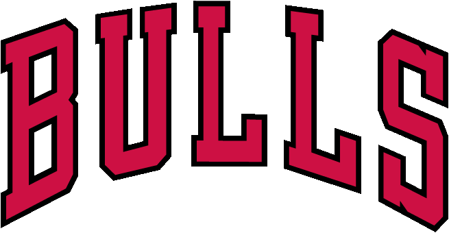
Typography and Color Palette
The Bulls’ wordmark is set in bold uppercase lettering with strong geometric proportions. It conveys authority, clarity, and permanence. The typography does not compete with the emblem; it supports it.
The color palette is among the most effective in sports branding. Red symbolizes intensity, passion, and blood. Black conveys power, intimidation, and seriousness. White provides contrast and balance. Together, they form a visual system that is aggressive yet refined.
This palette became synonymous with winning throughout the 1990s and remains instantly associated with championship basketball.
Uniform Identity and Visual Continuity
The Chicago Bulls uniforms mirror the logo’s discipline. Whether in white, red, or black, the visual language remains consistent across all variations. There is no excess decoration, no experimental striping, no unnecessary ornamentation.
This restraint reinforces the idea that the Bulls do not need to shout. Their identity is already understood.
Chicago Bulls Logo Heritage and Cultural Legacy
The Chicago Bulls logo heritage stands as one of the strongest examples of visual permanence in sports history. It survived changes in ownership, roster overhauls, and shifting league aesthetics without modification.
Within the broader context of sports logo heritage, the Bulls represent the pinnacle of brand alignment. Success, symbolism, and design converged at exactly the right moment in history, creating an identity that still resonates decades later.
For readers exploring how athletic branding achieves immortality, the Bulls are not just a case study. They are the benchmark.
FAQ: Chicago Bulls Logo Meaning and History
Why has the Chicago Bulls logo never changed?
Because the original design achieved instant recognition and became inseparable from the team’s success and legacy.
What does the Chicago Bulls logo represent?
The logo represents power, aggression, resilience, and dominance, embodied by the enraged bull.
Who designed the Chicago Bulls logo?
The logo was designed in 1966 by Dean P. Wessel.
Is the upside-down Bulls logo interpretation intentional?
No. The interpretation is an internet meme and has no official meaning or intent.