
Vans Logo History: Meaning, Symbolism & Brand Heritage
![]()
Just a few years after its founding in 1966, Vans became more than a footwear company. It turned into a cultural badge adopted by skateboarders, surfers, and creative communities across Southern California and beyond. While fashion trends and subcultures evolved, Vans remained deeply rooted in authenticity, rebellion, and individuality. Few brands have managed to preserve such a strong cultural identity for so long, and the Vans logo has played a crucial role in that success.
The Vans logo history is inseparable from skate culture. Its bold typography, unconventional proportions, and the iconic “Off the Wall” slogan express a philosophy rather than a marketing message. Vans’ logo heritage reflects a brand that never tried to polish its edges, choosing instead to amplify what made it different.
Meaning and History of the Vans Logo
Vans was founded in 1966 by Paul Van Doren, James Van Doren, Gordon Lee, and Serge D’Elia. Initially focused on producing durable shoes for skateboarders, the brand quickly became embedded in the emerging skate scene. Vans’ early success came not from advertising, but from organic adoption by skaters who valued grip, resilience, and authenticity.
The Vans logo meaning has always been direct and functional. It does not rely on abstract symbolism or decorative elements. Instead, it emphasizes strength, balance, and confidence through typography. Over time, the addition of the “Off the Wall” slogan further reinforced Vans’ connection to skateboarding slang and culture, cementing its place in the brand’s logo heritage.
Vans Logo Evolution Timeline
![]()
1966 – A Purely Typographic Beginning
The original Vans logo appeared in 1966 and was entirely typographic. The word “Vans” was written in a bold sans-serif style that would have appeared fairly standard if not for one crucial detail: the letter “V.”
The right arm of the “V” was extended horizontally, forming a roof-like line above the remaining letters “ans.” This unconventional detail instantly set the logo apart and introduced a sense of stability and dominance. Even in its earliest form, the Vans logo history showed a preference for structural boldness over ornamentation.
![]()
1970s – The Stencil Logo and a Skateboarder’s Hand
One of the most iconic moments in Vans logo history came in the 1970s, when the brand’s logotype was redesigned by a 13-year-old boy. Mark Van Doren, son of James Van Doren, created the logo as a stencil intended to be spray-painted on skateboards.
This stencil version of the logo later appeared on the heel tab of the Style 95 shoe, one of Vans’ earliest models. The authenticity of this origin story became part of Vans’ logo heritage, reinforcing the idea that the brand was shaped by the culture it served, not by corporate design agencies.
1976 – The Birth of “Off the Wall”
In 1976, Vans introduced one of its most important visual and cultural elements: the “Off the Wall” slogan. Borrowed directly from Californian skate slang, the phrase described the wild tricks skaters performed on the curved walls of empty swimming pools.
The slogan was incorporated into a new emblem featuring a stylized van-shaped form. This marked the first time Vans expanded beyond a simple wordmark, embedding cultural meaning directly into its logo system. “Off the Wall” quickly became synonymous with the brand’s identity and continues to accompany Vans’ logos to this day.
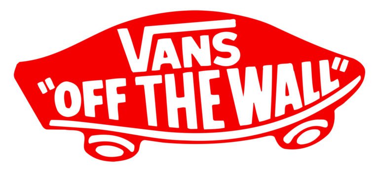
2016 – Today: Color, Refinement, and Global Consistency
In its modern form, the Vans logo retains its original structure while adopting a brighter and more standardized appearance. The word “Vans” is now rendered in red, placed within a rectangular shape, with the “Off the Wall” slogan positioned beneath it.
Subtle refinements were made to the letterforms, particularly the “A,” which became more open and balanced. Despite these updates, the logo remains unmistakably Vans. This continuity highlights the strength of Vans’ logo heritage, proving that meaningful design does not require constant reinvention.
![]()
Vans Logo Symbolism
The symbolism of the Vans logo is rooted in structure and attitude rather than imagery. The extended “V” acts as a visual anchor, symbolizing strength, shelter, and dominance. It creates a sense of unity across the wordmark, reinforcing stability and confidence.
The “Off the Wall” slogan adds a layer of cultural symbolism. It represents creativity, rebellion, and nonconformity, values that define both skateboarding and Vans as a brand. Together, the wordmark and slogan form a powerful expression of Vans’ logo meaning.
Typography and Color
Typography is the foundation of Vans’ visual identity. The bold, all-cap sans-serif typeface used in the logo is a modified version of Helvetica, a font widely used in the mid-20th century. Vans’ adaptation adds weight and character, turning a neutral typeface into a symbol of attitude and resilience.
Color usage has evolved throughout Vans logo history. Early versions featured blue lettering on white tags, while later designs introduced red to increase visibility and emotional impact. The modern palette primarily uses red and white, with black reserved for the “Off the Wall” slogan. This combination reinforces energy, clarity, and confidence.
Vans and the Power of Authentic Logo Heritage
The Vans logo history is a case study in cultural authenticity. Rather than chasing trends, Vans allowed its identity to grow organically from the community it served. The result is a logo heritage that feels timeless, honest, and deeply connected to skate culture.
By preserving its core typographic structure and embracing the spirit of “Off the Wall,” Vans created a logo that transcends fashion cycles. It stands not just as a brand mark, but as a symbol of individuality, creativity, and freedom.
Vans Logo FAQ
What does the Vans logo represent?
The Vans logo represents strength, stability, and confidence through bold typography and a distinctive extended “V.”
What is the meaning of “Off the Wall”?
“Off the Wall” is a skateboarding term referring to unconventional tricks performed on pool walls, symbolizing creativity and rebellion.
Who designed the Vans logo?
The iconic Vans stencil logo was created by Mark Van Doren, the 13-year-old son of company co-founder James Van Doren.
What font is used in the Vans logo?
The Vans logo uses a modified version of Helvetica, customized for heavier weight and stronger visual impact.
Why is Vans so closely tied to skate culture?
Vans gained popularity organically among skateboarders due to durable shoes and authentic engagement with the skate community, which shaped its logo heritage.