Red Bull Logo History: Meaning, Symbolism & Brand Heritage
![]()
Few modern brands have shaped global youth culture as profoundly as Red Bull. Introduced in 1987 by Austrian entrepreneur Dietrich Mateschitz, the drink arrived at a moment when functional beverages were still considered niche. Within a decade, Red Bull had transformed from an unfamiliar stimulant into a worldwide cultural phenomenon built on extreme sports, music, innovative marketing, and one of the most recognizable logos of the modern era.
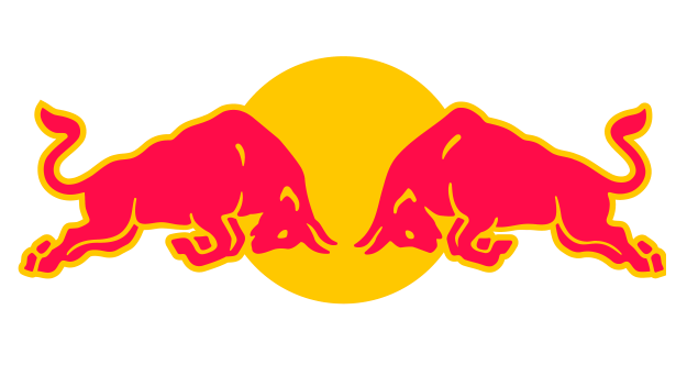
The identity that launched the brand has hardly changed since its debut. While competitors routinely revise their packaging, Red Bull relies on a visual system so distinctive and deeply embedded in brand mythology that redesigns have never been necessary. At the heart of this system is the now-iconic emblem: two red bulls charging against a golden sun, a mark that expresses energy, determination, intensity, and the competitive spirit that defines Red Bull’s global image.
Red Bull Meaning and Symbolism
The central elements of the Red Bull logo—two bulls, a sun disk, and a bold red wordmark—form a cohesive symbolic language. The bulls capture raw power, aggression, and forward momentum. Their stance, locked in collision, suggests confrontation, challenge, and the unleashing of physical strength.
Behind them sits a circular golden shape widely interpreted as the sun. It reinforces themes of vitality, heat, energy, and life force. When combined, these motifs create a visual narrative that aligns perfectly with the brand’s promise to “give wings” to physical and mental performance.
The logo’s origins are directly linked to Krating Daeng, the Thai tonic that inspired Mateschitz to create Red Bull. “Krating Daeng” translates to “red bull,” and the original Thai emblem likewise featured two charging bulls. Rather than erasing its inspiration, Red Bull paid tribute to it—modernizing the concept while preserving its essence. This continuity is a rare case of international brand adaptation that respects tradition while creating something globally iconic.
Brand Heritage
Red Bull’s rise is inseparable from its visual identity. Unlike beverage businesses that rely on traditional advertising, Red Bull built its brand through culture: sponsoring extreme sports, constructing media platforms, investing in avant-garde projects, and cultivating entire communities around performance, creativity, and risk-taking.
The logo became the badge of this culture. Whether printed on a Formula 1 car, a cliff-diving wetsuit, a music academy banner, or a racing helmet, the emblem served as a universal signifier of energy, competition, and ambition.
Red Bull Studios and the Red Bull Music Academy further expanded the brand’s visual ecosystem. For these projects, the digital agency Momkai adapted the core emblem into localized variations that referenced regional cultures while maintaining structural consistency—a testament to the logo’s adaptability and its deep symbolic foundations.
Red Bull Logo History & Evolution Timeline
![]()
1987 – Today: A Timeless Identity
The Red Bull logo has remained remarkably unchanged since its introduction in 1987. The emblem features:
• Two red bulls, muscular and in motion, meeting at the center in a dramatic collision
• A yellow sun disk behind them, intensifying the visual contrast
• A bold red wordmark, structurally geometric yet warm in tone
The durability of this design rests on its clarity and cultural resonance. The logo communicates energy even at a distance and functions effectively across packaging, broadcast media, sports equipment, merchandise, and architectural applications.
Though product sub-lines (Sugarfree, Zero, Editions) have introduced color accents and background changes, the bulls and sun motif remain untouched.
Typography
The Red Bull wordmark uses a custom sans-serif form inspired by geometric modernist typefaces of the twentieth century. Its closest relatives include Futura SH-Dem Bol, Futura BQ Demi Bold, Avant Garde Gothic, and other geometric fonts.
However, the Red Bull wordmark is not a direct copy of any existing typeface. Letters such as the “R” and “B” show subtle modifications in curvature, stroke weight, and terminal angles that enhance readability and visual balance when paired with the intricate emblem above.
The typeface’s solidity complements the dynamic illustration, grounding the brand’s identity in clarity and modernity.
Color Palette
Red Bull’s color strategy is one of the most recognizable in global consumer branding.
Red communicates intensity, energy, and power—attributes consistent with the brand’s functional benefits. It is the color of the bulls and of the wordmark, ensuring immediate visual impact.
Yellow reinforces vibrancy and warmth, representing sunlight, alertness, and stimulation.
Against this high-energy palette, the brand frequently pairs deep blue or silver in packaging, creating a crisp contrast that enhances shelf visibility.
Red and yellow together form an iconic combination that reads instantly in nearly every cultural environment, contributing greatly to Red Bull’s global success.
A Global Symbol of Energy and Aspiration
The Red Bull logo stands as one of the most enduring and effective marks in contemporary branding. Its combination of symbolic depth, cultural adaptability, and uncompromising visual clarity has allowed it to transcend the beverage category and become an emblem of performance, creativity, and possibility.
The two charging bulls and golden sun are not mere graphics—they are the foundation of a global identity that fuels sports, music, art, and innovation. Nearly forty years after its introduction, the Red Bull logo remains unchanged because it remains unrivaled, proving the lasting power of heritage, meaning, and purposeful design.
FAQ: The History, Design and Symbolism Behind the Red Bull Logo
What does the Red Bull logo represent?
It symbolizes energy, strength, and determination through the image of two bulls colliding in front of a glowing sun.
Why are there two bulls in the logo?
They represent power and competitive spirit, inspired by the original Thai drink Krating Daeng.
Has the Red Bull logo ever changed?
No. The core design introduced in 1987 has been retained in its original form.
What colors define the Red Bull brand?
Primarily red and yellow, supported by blue and silver in packaging variations.
Is Red Bull an Indian brand?
No. Red Bull was founded in Austria, though it is distributed globally, including in India.