
CNN Logo History: Meaning, Symbolism & Brand Heritage
![]()
How a Three-Letter Mark Became a Global Symbol of 24-Hour News
Few visual identities in modern media are as instantly recognizable as the bold, continuous red monogram of CNN. Born in 1980 alongside a new era of nonstop television journalism, the logo has remained almost untouched for more than four decades — a testament to its precision, clarity, and the cultural footprint of the network it represents.
To understand the CNN emblem is to understand the ambition behind the world’s first 24-hour news channel. Its creation coincided with a media revolution, and its enduring simplicity has made it one of the most iconic marks of the broadcast age.
This is the complete story of the CNN logo — its origins, its subtle refinements, and the role it has played in shaping a global news identity.
Origins of CNN: A New Era in Broadcast News
When Ted Turner launched Cable News Network on June 1, 1980, he was attempting something that many in the industry considered impossible: a news outlet that never stopped broadcasting. The idea of continuous news contradicted the established rhythms of television, where networks relied on scheduled newscasts.
Turner believed the world was changing — faster, more interconnected, and overwhelmingly visual. CNN would serve it minute-by-minute.
Within five years, the network expanded beyond the United States with CNN International, setting the foundation for what would eventually become a global multimedia empire: 25 networks, dozens of radio channels, a vast digital presence, and availability in more than 200 countries.
Against this background of rapid expansion, the logo needed to be durable, universal, and unmistakable — and it was.
Logo History & Evolution Timeline

1980–1984: The Debut of a Modern Classic
When CNN went on air in 1980, it did so with a logo that looked radically different from most news branding of the time. Designed by Anthony Guy Bost, the mark consisted of a single, unbroken line forming the three initials C-N-N.
The line traveled in a continuous stroke, looping into each letter without lifting — a metaphor for nonstop broadcasting and the seamless flow of information.
The original version was rendered in red and white, with the red slightly softer than contemporary versions. Even in its first iteration, the emblem carried a polished, confident presence that mirrored Turner’s ambition.
![]()
1984–2014: Refinement Through Color
In 1984, CNN updated the palette to a stronger, more vivid scarlet red. Nothing else changed.
The contours, proportions, and monoline structure remained exactly as they appeared on launch day. The new shade of red gave the logo more presence on broadcast screens and lent it a sharper identity at a time when CNN was expanding internationally.
This unwavering consistency helped cement CNN’s visual identity in an era when many competitors were redesigning frequently.
![]()
2014–Today: Deeper Color, Same Structure
The most recent evolution of the CNN logo occurred in 2014, when the red tone was deepened again — now closer to burgundy.
The shift was subtle but intentional: the richer color projects authority, seriousness, and maturity, aligning with CNN’s position as a longstanding global news institution.
For more than 40 years, the contours of the logo have never changed — a rarity in corporate design and a testament to the strength of the original concept.
![]()
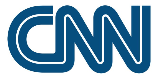
The CNN Logo Structure
At its core, the CNN emblem is a continuous double-line monogram. Its geometry balances repetition and symmetry:
– two parallel strokes form each letter
– each stroke flows into the next
– the curves never break
This “continuous line” concept visually represents the 24-hour news cycle. It also ensures instant recognizability — whether displayed at full scale on a studio wall or reduced to a tiny on-screen bug.
Its clarity makes it one of the most effective wordmark-monograms ever created.
Typeface and Design Characteristics
Although CNN’s logo is custom, its proportions resemble geometric monoline letterforms. The closest commercially available fonts are Quinceanera NF and Decked Out NF, though neither replicates the exact curves of the original.
Designer Anthony Guy Bost engineered the structure so each letter aligned perfectly in height and stroke width, giving the monogram a strong mechanical rhythm — modern, technical, and unmistakably broadcast-oriented.
Color Psychology: Why CNN Is Red
Red is one of the most expressive colors in the visual spectrum — energetic, urgent, commanding attention. It is widely used in news for its ability to signal importance.
In CNN’s case, the red hue also embodies the network’s identity:
urgency, determination, visibility, and presence.
The white negative space inside the strokes adds contrast and sharpness, making the logo readable on any background and in any format — analog broadcasts, digital screens, print, or satellite feeds.
CNN Special Versions: CNN Money & Other Extensions
CNN Money, one of the network’s prominent business verticals, uses the same monogram but introduces a different color palette (blue and white) and a clean sans-serif “Money” wordmark.
This structure keeps the brand unified while giving the financial division its own visual flavor.
Other CNN sub-brands — CNN International, CNN en Español, CNN Chile — maintain the red monogram as their core, proving its flexibility across languages and cultures.
Cultural Impact: A Logo in the Global Spotlight
The CNN logo has appeared at nearly every major world event of the last four decades — on screens, microphones, satellite trucks, social media feeds, and breaking-news chyrons.
It has travelled to battlefields, political debates, presidential inaugurations, disaster zones, and space missions. Few logos have become as omnipresent in global culture.
Its visibility was highlighted dramatically in 2017, when U.S. President Donald Trump published a video depicting himself “wrestling” a figure with the CNN logo imposed on its head. The controversy underscored how deeply embedded CNN’s mark is in political and cultural discourse.
Why the CNN Logo Endures
The emblem has remained effective for more than 40 years because it captures the essence of the brand with almost mathematical clarity:
continuous line — continuous news
bold stroke — bold journalism
minimal form — global adaptability
It is one of the few modern logos that has achieved near-universal recognition without ever needing a redesign.
The Mark of a Global News Pioneer
From its inception in 1980 to its position today as one of the world’s most influential media brands, CNN has built its identity on consistency, immediacy, and clarity.
Its logo encapsulates those values in three letters — a timeless monogram built from a single, unbroken stroke. The visual identity of CNN is not only a corporate symbol, but a cultural landmark of the broadcast age, representing a revolution in how the world consumes news.
Frequently Asked Questions About the CNN Logo
What does the CNN logo represent?
The CNN logo is formed from a single continuous line, symbolizing the network’s 24-hour flow of news and its uninterrupted global coverage.
Who designed the CNN logo?
The original CNN logo was designed by Anthony Guy Bost in 1980. His monoline concept has remained almost unchanged for more than four decades.
Why is the CNN logo red?
Red was chosen for its urgency, visibility, and association with global news. It stands out on broadcast screens and reinforces the sense of immediacy central to CNN’s identity.
Has the CNN logo changed over time?
The structure has remained the same since 1980. Only the color tone has changed twice: a brighter red in 1984 and a deeper, richer red in 2014.
Why is the CNN logo so iconic?
Its simplicity, geometric clarity, and unbroken-line concept create instant recognizability. Combined with the network’s global presence, it has become one of the most enduring marks in modern media.