Moncler Logo History: Meaning, Symbolism & Brand Heritage
![]()
From its beginnings in a small French mountain village to its position today as one of the world’s most coveted luxury outerwear houses, Moncler has cultivated a visual identity that is as enduring as its legacy.
Founded in 1952 in Monestier-de-Clermont, a rugged Alpine settlement near Grenoble, the brand initially produced sleeping bags and mountaineering equipment. What began as functional gear for extreme climates evolved into a global symbol of elite ski culture, craftsmanship, and contemporary luxury.
Throughout this journey, the Moncler logo has remained a constant presence: a compact, unmistakable emblem that fuses national pride, alpine heritage, and timeless graphic clarity.
Meaning & Symbolism
The name Moncler derives directly from its birthplace, Monestier-de-Clermont, a detail that anchors the brand in the landscape that shaped its early identity. The mountains, the cold, and the technical demands of the Alps are woven into Moncler’s DNA, and naturally into its visual language. Over time, as the brand transitioned from equipment to high-performance coats, and eventually to high fashion, its logo became a shorthand for authenticity — a seal that guaranteed protection, durability, and refined style.
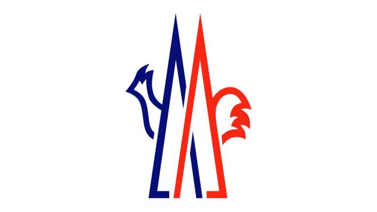
The emblem blends several layers of symbolism. The prominent cockerel is a national symbol of France, standing for pride, vigilance, and resilience. For Moncler, the rooster became especially meaningful in the 1960s, when the brand served as official supplier to the French Olympic ski team. Its presence evokes both national heritage and sporting excellence. The stylized “M,” interwoven with the silhouette of the rooster, suggests the peaks of the Alps and the upward thrust of mountaineering ambition. Together these elements form a visual poem of ascent, identity, and timeless elegance.
The color palette of the logo — the tricolor blue, white, and red — directly references the French flag. These colors signify stability and loyalty (blue), purity and technical precision (white), and passion, energy, and daring performance (red). Beyond their national resonance, they capture Moncler’s transition from alpine utility to global luxury.
Logo Evolution: 1952 – Today
The evolution of the Moncler logo is notable for its continuity rather than for radical transformation. Since the brand’s founding, the essential architecture of its visual identity has remained intact: a dignified serif wordmark paired with a compact emblem that sits confidently above it. This stability reflects Moncler’s deep respect for its heritage and its consistent message of excellence.
The wordmark, set in emphatic capital letters, is executed in a bold glyphic serif reminiscent of Friz Quadrata. The sculpted weight of the letters conveys trust, tradition, and authority. It is a typeface that is neither extravagant nor overly decorative; instead, it channels the elegance of European luxury through the lens of alpine pragmatism.
Above this refined typography stands the emblem itself — a union of blue and red strokes forming a stylized “M” intertwined with the proud outline of a French cockerel. This emblem first entered the brand’s visual identity during the 1960s, a pivotal moment when Moncler outfitted the French Olympic ski team and cemented its association with national sporting prestige. The rooster, long a symbol of France, represents courage and vigilance, while the angular “M” recalls the silhouette of alpine peaks, grounding the brand in its mountain origins.
The tri-color scheme of blue, white, and red further reinforces this dual identity: at once French and alpine, luxurious and technical, patriotic and globally resonant. The constancy of the palette has helped make the Moncler insignia one of the most instantly recognizable emblems in modern fashion. Over the decades, minor refinements have polished the logo’s contours, but its form and its meaning have endured with remarkable purity.
![]()
Emblem
The emblem that appears on Moncler’s jackets and outerwear takes the core elements of the main logo and encloses them within a soft-edged shield. The wordmark arcs gracefully along the inside of this crest, forming a harmonious frame around the stylized rooster and “M.” This badge, often embroidered or rendered in raised rubber, has become one of the most iconic hallmarks of luxury outerwear. To see it on a sleeve is to instantly recognize a heritage of quality, warmth, and elite alpine design.
Font & Typography
The typography of Moncler is a study in European elegance tempered by technical precision. The serif typeface evokes classical proportion and timeless refinement, with balanced vertical strokes and sculptural terminals. Its confident geometry underscores Moncler’s stature as a brand built on both function and sophistication. The use of uppercase letters gives the wordmark a stately rhythm, and the spacing between characters creates a sense of airiness that offsets the density of winter outerwear. Every detail speaks to a brand with nothing to prove, relying on clarity rather than embellishment.
Color Palette
The Moncler palette mirrors the French tricolor: deep blue, vivid red, and pure white. These three colors are woven throughout the brand’s identity, from the emblem to the design of heritage parkas and Olympic-era gear. Blue conveys security, reliability, and technical mastery — qualities essential to Moncler’s origins. Red introduces a striking note of energy and performance. White represents purity, clarity, and the pristine Alpine landscapes that shaped the brand’s early vision. Together, they create a palette that is both patriotic and universally sophisticated, aligning perfectly with Moncler’s dual identity as an Alpine specialist and a global luxury powerhouse.
The Enduring Power of an Alpine Icon
The Moncler logo is more than a brand mark; it is a symbol of excellence shaped by mountains, national pride, and decades of craftsmanship. Its longevity and minimal evolution speak to the clarity of the brand’s vision from the beginning. In a world where fashion logos are constantly redesigned to keep pace with trends, Moncler stands apart — its emblem still carrying the same spirit of adventure, precision, and refinement that defined its earliest days in Monestier-de-Clermont. This is logo heritage in its purest form: timeless, rooted, and instantly recognizable.
FAQ — Moncler Logo History & Meaning
Why does the Moncler logo feature a rooster?
Because the rooster is a national symbol of France, adopted into the logo in the 1960s when Moncler outfitted the French Olympic ski team.
What does the “M” in the Moncler emblem represent?
It symbolizes both the initial of the brand’s name and the silhouette of alpine peaks, reflecting the brand’s origins in the mountains.
Has the Moncler logo changed over time?
Only in minor refinements. The essential structure — emblem above wordmark, tricolor palette — has remained the same since 1952.
Why is the Moncler color palette blue, white, and red?
It reflects the French flag and symbolizes stability, purity, passion, and performance.
What is the emblem seen on Moncler jackets?
It is a crest-shaped badge containing the stylized rooster, the “M,” and the arched Moncler wordmark.